




The Small Volume Clue Most Gold Traders Ignore Inside a Bullish Engulfing


Most traders look at a Bullish Engulfing candle and immediately ask: “Is this a buy signal?” After testing XAUUSD on lower timeframes, I think that question is too simple. A better question is: “What happened to tick volume during the Bullish Engulfing formation itself?”
For this test, the root pattern is simple: a bearish candle appears first, then a bullish candle appears after it, and the bullish candle closes above the previous bearish candle’s high. That is the Bullish Engulfing structure I used as the base condition. But instead of treating every Bullish Engulfing as the same signal, I separated the data based on one small tick-volume behaviour inside the two-candle formation: did the bullish engulfing candle print higher tick volume than the bearish candle it engulfed?
That is all. Not a magic indicator. Not a complicated system. Not “buy every high-volume engulfing candle”. Just one clean statistical split. When I tested this on XAUUSD M5 and XAUUSD M15, the split was surprisingly balanced. For XAUUSD M5, the two groups were roughly 54% and 46%. For XAUUSD M15, the distribution was very similar, also around 54% and 46%.
This is important because many traders make a common mistake when reading volume. They treat volume as a general idea: high volume = strong, low volume = weak, bullish candle + high volume = buy. But Gold is rarely that simple. In my view, volume becomes more useful when it is measured as part of the pattern structure itself.
A Bullish Engulfing where the bullish candle comes in with stronger tick-volume participation is not necessarily the same as a Bullish Engulfing where the bullish candle appears with weaker participation. The candle pattern may look similar visually, but statistically, the internal behaviour of the pattern is not the same.
That is where many traders get trapped. They see the same candlestick name. They expect the same outcome. Then they wonder why one setup reacts cleanly while another fails immediately. The problem may not be the Bullish Engulfing pattern. The problem may be that different internal states are being grouped into one basket.
This is why I no longer ask: “Does Bullish Engulfing work on Gold?” I ask: “Which type of Bullish Engulfing is worth studying further?” There is a big difference between those two questions. Averaging all Bullish Engulfing setups together can hide useful information. Some conditions may support continuation, some may fail, and some may be noise.
The edge is not always in adding another indicator. Sometimes it starts by taking one familiar pattern and splitting it properly. For now, I am still not sharing the full rule set because I am still testing it across different entry models and timeframes. But one early observation is clear: inside the Bullish Engulfing formation, a simple tick-volume comparison between the bearish candle and the bullish engulfing candle creates two clean groups on both XAUUSD M5 and XAUUSD M15.
That does not mean it is a complete trading system. It does not mean “higher volume = automatic buy”. It simply means the pattern becomes more interesting when the internal volume behaviour is measured instead of assumed. Most traders see the candle. Fewer traders measure what happened inside the candle pair. And sometimes, that small difference is where the useful data starts.
Most traders see a Bullish Engulfing on XAUUSD M5 and immediately ask, “Buy or not?” I think that question is too basic. I tested the same Bullish Engulfing root pattern with just one simple internal tick-volume split inside the two-candle formation. Nothing fancy. No indicator stack. Just asking whether the bullish engulfing candle showed stronger participation than the bearish candle it engulfed.
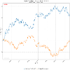
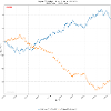
The attached chart is what made it interesting. One 3R/3R BUY model under one volume state built a strong positive cumulative curve. The opposite 3R/3R SELL model under the other state moved mostly in the opposite direction and spent a long time below breakeven. Same root pattern. Similar win rate area. Very different cumulative behaviour.
That is the part many candlestick traders miss. A Bullish Engulfing is not always the same Bullish Engulfing. The candle shape may look identical, but the internal condition behind it can change which risk/reward model deserves attention.
So my takeaway is not “volume gives a direct signal.” My takeaway is simpler: even one small volume split can expose which setup is worth studying and which setup may be a trap. Most traders see the candle. Fewer measure what happened inside the candle pair.